An exercise in CSS masonry
Masonry layouts have been around a long time. You’ll most likely recognize its use on Pinterest. In fact, Pinterest so popularized the use of this layout that it’s also known as the “Pinterest style layout”.
But even after being around for a while, they’re still one of the most effective ways of laying out a gallery, a portfolio, a dashboard, or any grouping of times. Masonry, at its core, is a grid-based layout with rows containing items of variable heights. However, as these dynamically sized items wrap and stack on top of each other, they leave no unnecessary gap between the items.
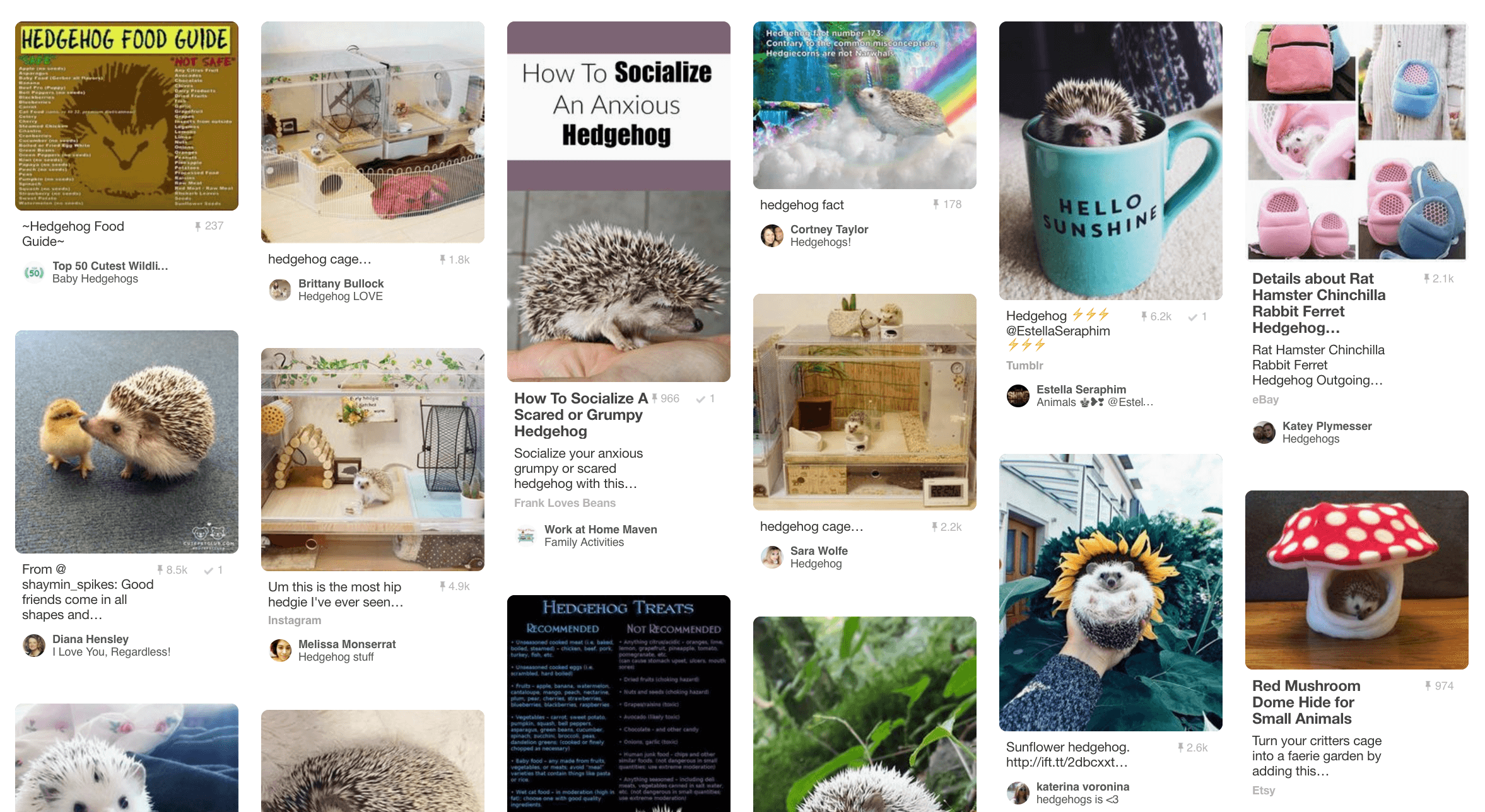 A masonry of hedgies!!! 😍
While a simple layout in theory (“maybe we can just use floats?”), CSS does not actually make this easy to implement. Using floats will not reduce the spaces between differently sized items. Instead you will end up with something along the lines of this:
 eh…no
eh…no
However, it is possible to achieve a basic masonry layout without any JavaScript. So today I’m going to explore two pure CSS methods I’ve found useful in implementing this layout.
CSS multi-columns
The CSS multi-column layout was first introduced with CSS3 to allow for breaking a block of text into multiple columns, giving readers a more newspaper-like reading experience.
We can use two of these classes to get the masonry effect we want.
First, our HTML will be structured like so:
<div class="masonry">
  <div class="item">
    <div class="item__content">
    </div>
  </div>
  <div class="item">
    <div class="item__content">
    </div>
  </div>
  <!-- more items -->
</div>
The div with class .masonry will serve as the main container for all the different sized items.
.masonry {
  column-count: 5;
  column-gap: 0;
}
Column count is used for dictating the number of columns you want to appear in your layout. In this case, we’re creating a masonry layout with five columns, so we’re simply setting that property to five. The browser will then automatically set the maximum column height for each column so that they are all roughly equal in height.
We are also setting column-gap to 0, which controls the amount of space between columns, but not rows. So, instead of dictating that space on each column, we’ll actually let the .item element take care of that with its own padding. These .item elements actually act as a container to control the spacing between elements. This way the spacing all around each item will stay consistent without any funky wrapping.
.item {
  break-inside: avoid;
  box-sizing: border-box;
  padding: 10px;
}
It’s also very important to add break-inside: avoid to the items making up the masonry. Since multi-column layouts were first created with breaking blocks of text into separate columns in mind, without this class, the content blocks may break and span across columns. Not ideal.
Now we can proceed to style the actual .item-content.
.item__content {
    background: purple;
}
In my humble opinion, this multi-column method for achieving the masonry effect is the most flexible and forgiving method and is partially or completely supported in all modern browsers.
It is also very easy to make our masonry layout responsive with the multi-column method. To implement responsiveness with a mobile-first mindset, we can simply change the column-count property on the .masonry container based on viewport size. As the viewport increases in size, the more columns we’ll want our masonry layout to have.
.masonry {
  column-count: 1; // one column on mobile
}
@media (min-width: 400px) {
  .masonry {
    column-count: 2; // two columns on larger phones
  }
}
@media (min-width: 1200px) {
  .masonry {
    column-count: 3; // three columns on...you get it
  }
}
<!-- etc. -->
You can see this in action in a little CodePen I put together here:
Still, I know even after all the “multi-column-for-masonry!” propaganda I’ve spouted at you, you’re probably still wondering: “but what about FLEXBOX?!?!” Welp.
Flexbox-based masonry
So, this part assumes that you’ve at least played around with flexbox a little or are familiar with its properties. If not, go learn about it here, play around with it here, or preorder a highly anticipated guide there.
There’s two main strategies of implementing a flex-based masonry layout and both come with caveats:
- Use one main
flex-direction: columncontainer around all items that wraps - Use separate column containers to wrap items for an individual column
Let’s break out the code.
One main column container
For that first strategy, your markup should closely resemble/be identical to the markup used in the multi-column layout method; the CSS for the .masonry container is where it gets funky.
.masonry {
  display: flex;
  flex-flow: column wrap;
  width: 100%;
  height: 800px;
}
Where before, .masonry was used to control column-count, we’re now replacing that with flexbox column that wraps. The key thing to take away from that snippet of CSS though, is that set height. It can be 100vh or a pixel-based height, but it must be set. Without it, your columns will never wrap.
.item {
  box-sizing: border-box;
  padding: 10px;
}

.item__content {
    background: purple;
}
The child elements, .item and .item-content will be styled the same way as with the multi-column layout method, but without a need for break-inside: avoid on the .item class.
With this flexbox method, it’s possible to make your layout responsive by adding media queries on the .masonry container. You would have to manually adjust the height at each viewport size to allow for appropriate wrapping to occur for the number of columns you desire.
.masonry {
  height: auto;
}

@media screen and (min-width: 400px) {
  .masonry {
    height: 1600px;
  }
}

@media screen and (min-width: 600px) {
  .masonry {
    height: 1300px;
  }
}

@media screen and (min-width: 800px) {
  .masonry {
    height: 1100px;
  }
}

@media screen and (min-width: 1100px) {
  .masonry {
    height: 800px;
  }
}
You can see an example of this here:
Obviously, attempting to dynamically determine the height in order to appropriately wrap your columns is not the most effective strategy, especially when it comes to responsiveness. So let’s see what strategy #2 has to offer us.
Separate column containers
This method requires you to change your markup so you have a bit more control of what goes in each column, instead of relying on set heights. Your markup would look something like this for a three-column masonry layout.
<div class="masonry">
  <div class="column">
    <div class="item">
      <div class="item__content">
      </div>
    </div>
    <!-- more items -->
  </div>
  <div class="column">
    <div class="item">
      <div class="item__content">
      </div>
    </div>
    <!-- more items -->
  </div>
  <div class="column">
    <div class="item">
      <div class="item__content">
      </div>
    </div>
    <!-- more items -->
  </div>
</div>
In this case, both the .masonry and .column containers need to be set with a display: flex:
.masonry {
  display: flex;
  flex-direction: row;
}

.column {
  display: flex;
  flex-direction: column;
  width: calc(100%/3);
}
While you have a little more control over how the columns are laid out, obviously, it still takes some initial planning in figuring out how to structure your markup. And, it would be a lot more difficult to scale if you were to add other items to your masonry grid.
And the only responsiveness you could add to this layout would be to change it from several columns to being one column on mobile:
.masonry {
  display: flex;
  flex-direction: column;
}

@media only screen and (min-width: 500px) {
  .masonry {
    flex-direction: row;
  }
}

.column {
  display: flex;
  flex-flow: column wrap;
  width: 100%;
}

@media only screen and (min-width: 500px) {
  .column {
    width: calc(100%/5);
  }
}
Check out this method below:
All in All
While flexbox implementations of the masonry layout can be achieved, they require a lot more forethought, aren’t desirable for scaling, and are simply rather hacky. For a pure CSS solution, the multi-column method wins out pretty fairly and squarely.
However, it is still not perfect. One key issue with these techniques is that it changes the reading order from “left to right THEN top to bottom” to “top to bottom THEN left to right”, which is highly unintuitive for most users. You will need to have full control over the ordering of the content in order to make it retain the typical reading order when using this technique which often gets tricky when you’re dynamically loading in content. This also presents a problem when you want the items in your grid to be sortable, instead of hardcoded in order.
You will also have to be aware of browser support for the multi-column technique. It will fall short when you have to support browsers that don’t offer complete support of the CSS multi-column layout. For those situations, you will still have to resort to a fallback in the form of a JavaScript solution.
So, phew, long post, but those are my experiences with pure CSS masonry layouts. I would love to hear about your experiences, thoughts, critiques, and/or questions! Feel free to tweet at or email me.
And also, first ever technical blog post, yay! 🎉